


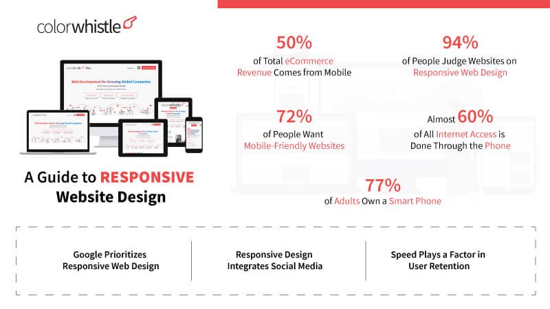
A Guide to Responsive Website Design – From the Planning Stage to the Finished Product
Introduction
If you’ve been reading around the subject of responsive website design and development, then you will have most likely encountered the term ‘responsive design’. But what does this mean?
Simply put, responsive web design means that a website has been built in such a way that the design and shape will change in order to accommodate different screen sizes and resolutions. Thus a website should look good whether you’re viewing it on a tiny smartphone or a massive 4K television set.
Consider this post as a guide to responsive website design.
Skills Required
So what are the skills required to develop a responsive website? You will need basic HTML and CSS knowledge in order to start with responsive web design. A little bit of logical thinking is also required if you need to be successful in it ☺.
In this blog, we will use CSS media queries to convert the website to a responsive one. CSS media queries are nothing but a block of CSS written for a specific browser window width. For Example consider a smart phone, the screen size of the smart phone is 480 pixels. In this case, the media query that we will write is @media screen and (max-width:480px){ }. The CSS that we add in this media query will be included for only devices with browser window width, equal to and lesser than 480 pixels.
Basic Media Screen Properties
There are certain basic media screen properties that you should know before starting the responsive web design. They are “min-width”, ”max-width”, ”min-height”, “max-height”, “min-device-width”, ”max-device-width”, “orientation”. Understanding the above properties is easy and you will be able to get a clear idea of the properties by following this link.
Screen Widths
Now we have an idea about the skills required and the basic media screen properties that we should know. We will also need an idea of what is the screen widths for which we should write the responsive code. With the huge amount of mobile and tablet devices in the market today, it is not possible to make your website compatible for all devices using the CSS media queries. But what we can do is, we can cover maximum devices by writing the responsive code for standard screen widths.
This site here provides more clarity on the standard device screens.
Planning a Responsive Website Design
The planning stage for building a responsive website should start from building the HTML layout of a website.
For eg. The HTML layout should be added in such a way after planning the elements which should appear first in mobile phones. It will be tough to show some elements at the top on mobile phones if the HTML is not added in such a way. The best way to sort out this issue is to plan HTML accordingly or use CSS frameworks.
CSS Frameworks are the best way to build a responsive web design without much effort. You should have already come across a term called Bootstrap. It is considered to be one of the best CSS framework developed till date. You can download Bootstrap here.
Testing and Bug Fixing
Browsers such a Chrome and Firefox have their own functions for responsive testing.
In Google Chrome, you can use the shortcut CTRL + SHIFT + I to open the inspector and then use CTRL + SHIFT + M to open the responsive testing screens. In Firefox, you can use CTRL + SHIFT + M to test.
The best way to fix responsive issues is by starting from larger Screen to smaller screens. Designing in this way will reduce the time taken for converting smaller screens to responsive.
In addition to browser testing functions, there are certain online responsive testing tools that you can use
Conclusion
To conclude, responsive design is very much recommended for any modern websites and is practically a necessity. Just make sure that you use the right web design company and take the time to think about how everything is going to change in response to screen dimensions.
If you have any more questions, just Get in touch and we’ll be sure to help you decide the best solutions for your business!
 Compare Custom PHP Frameworks and CMS


