Website Design Tips for Conference and Events
There are some hard and fast rules that web designers can follow to ensure that their sites will look as attractive as possible and to ensure they are easy to navigate and interact with.
While this is true though, the specifics of web design can also vary somewhat depending on your precise requirements. A great B2B web design for instance is going to have some distinct differences when compared with a great B2C website design.
And likewise, websites about conferences and events will also tend to have some unique traits that set them apart from the rest.
So if you’re going to be hosting some kind of event to promote your brand, how would you design your website differently? What unique design elements will ensure your site is optimized for its intended purpose?
Design and Layout
Let’s start with the basic layout and structure. Here, it’s particularly popular for ‘event’ websites to feature a linear design and even an ‘infinite scrolling’ layout. This basically means that you are going to put everything onto a single page and place all your content vertically. At the top you’ll have your ‘welcome’ section, below that you might have some key details about the event, speakers, links and whatever else you want to place.
This type of layout doesn’t even need a menu as such, though if you choose to add one it will use ‘a name’ tags. This means it will link to content on the same page so that scrolling takes the user straight down to that page. What’s interesting about this technique is that users may not even realize that they’re everything is all on one page.
Why is this type of design popular for an event? Mainly because it’s just simple and because it encourages continued reading. Events are generally one offs or annual in nature and that means that there’s not a ton of content to add. People only really need to know when the event is, how much it costs and why it’s worth their time – there’s simply not enough content in many cases to fill an entire website with separate pages.
This is also a very good layout for responsive website design, it’s easy for you to manage and update and it’s fun for the user. It’s popular at the moment owing to its minimal appeal and it lets you add some interesting effects and features too – one of the most popular being the ‘parallax’ effect which means the background scrolls at a different speed creating a sense of depth.
Here are some websites, we designed for a conference or event.
http://dbajakartalive.com/, http://dbasurabayalive.com/
Lets see some interesting examples of conference websites, present in the web.
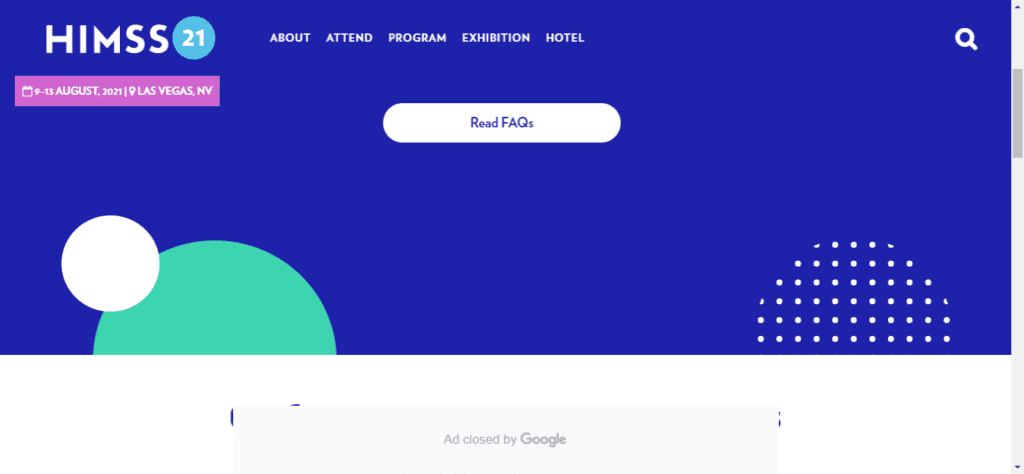
1) Himssconference
The site has a perfect blend of colors and content which makes the audience get easily connect with the website. The banner area has a very engaging video and a strong banner content.
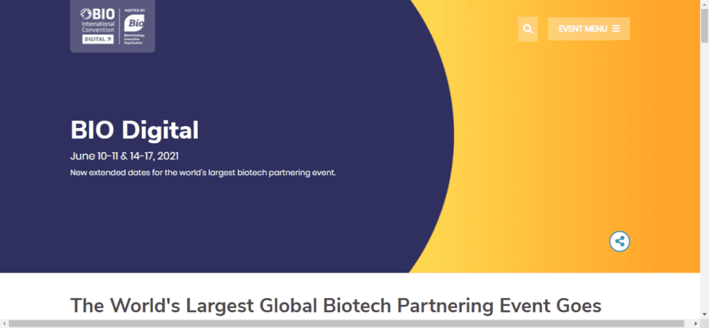
2) BIO Internation Convention
This site is a good blend of old and new design. The banner is straight forward which says that it has a early bird offer too. The navigation is made easy by clear highlights through out the website
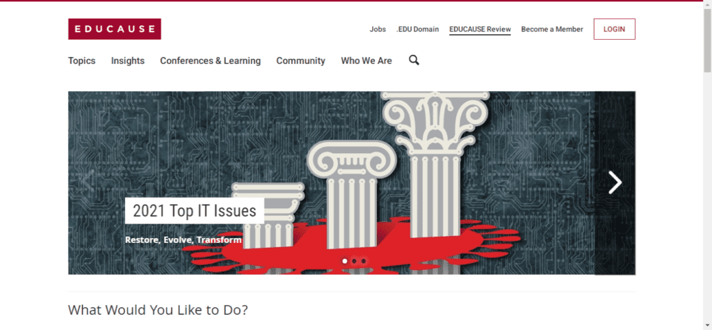
3) EDUCAUSE
This is a brilliant example of a simple website, which is to the point. The menu items are boldly highlighted for easy navigation.
Features to Include
While most events will use a relatively simple design, you nevertheless want to ensure that you include certain features so that your audience get all the details they need.
Most events for instance will want a blog which will normally mean external pages. You should also include some kind of slider or featured content on the main page in order to ensure that readers see the blog posts quickly.
Blogs are useful because they allow you to add news and updates which builds buzz and excitement and offers a large amount of SEO benefit.
It’s also a good idea for similar reasons to add a social media feed. Having a Twitter feed in one column is great for keeping the site alive and for updating regular visitors. A countdown timer can also help to build anticipation while a mailing list will be very useful for collecting email addresses to turn leads into customers/attendees.
All these features will likely go at the top of the site ensuring they’re immediately visible. Likewise, you should be sure to add the most important details at the top too – those being the location, date and time of the event.
All of this is very easy to build using WordPress and a WordPress website development company.
More Tips and Advice
While this basic structure won’t see you wrong, it’s of course fine to branch out and you may opt to get more creative with your layout. It’s up to you if you want to include more pages, or if you want to go with an entirely different structure.
Either way, you’ll also need to think about the color and the look of the design too. This will likely be up to your website development company who will follow your advice and suggestions. Make sure that you think carefully about how you want your event to be seen – B2B events should use a more formal web design for example as compared with B2C events. Your branding will also likely need to be incorporated into the scheme.
If you need more ideas, consider checking out events for other websites and seeing what you like or don’t like about those. Or of course you can give ColorWhistle a call! We’re a WordPress website development company and would be more than happy to offer you a free consultation.